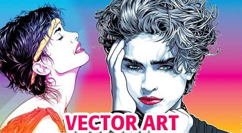
Vector graphics is the use of geometrical primitive such as points, lines, curves and shapes all of which are based on mathematical expressions to represent image in computer graphics. Vector graphics are based on vectors, which lead through locations called control points. Each of these points has a definite position on the x and y axes of the work plane and determines the direction of the path. Vector graphics can be magnified infinitely without loss of quality, while pixel-based graphics cannot.
Vector illustration is one of the creative outputs. Once you have learn the basics, it’s really enjoyment, playing with the colors. This article will give you first few tools and tips you will need to be on your way making vector illustrations with Adobe Illustrator.
Here I’ll take you through 10 steps that will introduce you to the fundamentals, including the key tools, and get you started on the road to translating your creative vision into incredible vector illustrations.
1. Setting Up
On first opening Illustrator, you’ll need an Art board; this is the document or area you work on. Click File>New, and apply the size you’d like for your image if size is irrelevant when you’re learning, choose A4 from the drop down menu. In the Advanced section you can also choose from CMYK if you’re illustrating for print or RGB if you’re working for the web.
2. Save As You Go
As you work it is best to get into the habit of saving your work as you go along. Firstly click File>Save As. to name your file and choose where to store it on your computer. Every time you then want to save the file as it stands at any moment just click File>Save, or use the shortcut key Ctrl+S. I recommend getting into the habit of saving like this every minute, so nothing is ever lost should your computer crash. You can repeat this process to save separate, newer versions of the artwork as separate files.
3. Break Down Your Composition into Base Shapes
When you want to tackle a subject, consider breaking it down into base shapes. Base shapes are shapes which represent core areas of a design. They’re great for creating, as you can get a good impression of the overall composition based purely on these flat shapes of color.
4. Use Scribble
This is one of those features that you never know when it will come in handy. I have used it several times for logos or in the backgrounds of some websites. Like with most things moderation with this is essential. To utilize Scribble you must create a shape and then go to Effect>Stylize>Scribble. You will get to choose from options such as Childlike, Snarl, Sketch or Zig-Zag. You can create some pretty interesting compositions and have full control over the amount, line options, spacing and angles.
5. Use Color Guide
Color guide is nice feature. It is a great time saver when you want different shades and tints of a color. It also provides other color options to match your current color choice. Simply chose a color and make sure your color guide is open then start easily experimenting with different colors.
6. Look For Repeating Elements
Many objects and scenes have repeating elements. Being able to spot them will save you time in workflow. If you’re going for a realistic look, learn how to duplicate elements and then modify them to make them look unique. There’s nothing worse than a realistic render and elements looking like carbon copies. However, if you’re working with something a lot simpler, there’s no shame in copy and paste.
7. Learn How Brushes Can Save Time
Like repeating elements brushes can work in a similar way. If you can identify a simple object being used over and over again, consider it may be easier to make it in to a brush. I love brushes and I love seeing creative ways of using them to support illustrations and sometimes making them the core of illustration.
8. Text Sampling
It is a simple topic but if you didn’t know it can save you a bunch of time. you have created a piece of text, and it’s the perfect size and font and you need four other headlines to have the same. Instead of manually adding in the font size and the font name simply use the eyedropper to select the font and it will copy those attributes to your current text.
9. Keep It Consist
Always keep consistency of style in your mind in every element of your illustration. If add too many different styles and too many jarring shapes, the illustration will trend to lack authority. Try to add your style in to every vector element in your work, no matter how small this will keep your work consist.
10. Don’t Use Trace Tool
Even though it may seem like a handy option, don’t use the Auto Trace tool in Illustrator, or use trace shapes within your design – the results always tend to look obvious and amateurish. I think this rule holds true no matter how well the tracing has been done.
Hopefully this article will give you a clear idea about vector and how to create vector illustrations. This is an art of making caricature of any art work. So, you should take in mind deeply all the points to make creative and eye catching vector art. Clipping Path Experts is a expert vector artist and provides raster to vector conversion, Photoshop clipping path service, image retouching getting low cost. If you have any kind of help about making professional vector art work you can contact with us, we always ready to complete the vast amount of vector work.